Saturday, May 31, 2008

A#6 - ublo booth graphics


The above graphic will be used in the ublo booth and will be presented on the graphic displays in the upper left and right corners. The right and left graphics fold into the centre one for transportation. Variations of this graphic can and will be created.

A#6 - ublo booth mock-up

Rough 3D mock-up


Examples of furniture to be used

A#6 - ublo booth floor plan

The booth floor plan

Wednesday, May 28, 2008

A#6 - ublo website

The initial page will be a flash presentation, expressing ublo and its products. Words describing Rohan Nichols creations will flow/appear throughout the presentation giving viewers an idea of what it is ublo strive to create. Words like:
  • Clean
  • Modern
  • Original
  • Innovative
  • Stylish
  • Unique

Item 'ladies bag' being displayed on the products page.

Item 'specs case' being displayed on the products page.

The website continues to keep the ublo theme being created consistent. The website has been left clean, simple and easy to navigate.

Tuesday, May 27, 2008

A#6 - ublo website navigation

The navigation of the website for ublo is such that any page can be accessed from anywhere on the site. This minimises confusion and having to use the 'back' button excessively, if at all. It also gives users a simple, friendly experience and makes finding information easy.

A#6 - ublo letterhead

The finished letterhead keeps the ublo theme consistent. The top of the letterhead has the right angled edge on the right so that filing and use fo the paper is easier.

A#6 - ublo business card


The final ublo business card design shown at both 300dpi and 72dpi to show detail and to demonstrate that it works at minimal size.
This graphic display of the card also demonstrates the papers texture that will be used in final production. It will be recycled paper, giving a coarser finish. The text in the image has also been textured to give a better understanding of how it will look printed.
On the reverse side (contact details) the ublo logo was kept dark so that the focus was on Nichols contact details.

A#6 - ublo logo finals


The three final logo designs for ublo!
It was decided that the first of the three be used for the project as it is free flowing, simple, effective and we feel captures ublos essence best. Variations of this logo were created, however this one was the most distinguishable and therefore chosen to be the face of ublo.
The other two logos were deemed weak and didn't scream individuality and originality, something ublo strives for in every product creation.

Saturday, May 17, 2008

ublo drafts #2

These are pretty much exactly the same but ones (light blue) is thicker (requested by padraig) and, all the small ones are super small to show they can resize properly and then the two bottom ones are variations of the B because it seemed as though the U was getting lost in the original logo. I don't like the change much but if it makes it more recognisable then it's probably a good thing.


SO yeah, click on em, they go big!

Tuesday, May 13, 2008

ublo drafts

So i've got some drafts for the logo and thought i'd put them up on here. Clearly I can do them in any colour, and i've tried to show that they resize well. The black one is a 30% scale of the original (the orange one), and then the pinkish one is scaled even further - and im pretty sure this one wont work because I think the symbol's meant to be separate from the logotype...i'm not too sure if the green one works too cos of the way ublo is broken up but thought i'd whack it up anyway.


The next ublo draft is a messier approach with a different symbol. I kinda like it but didn't think it went with the whole rohan nichol approach to things...not clean enough.

Anyway, all input's welcome, so leave comments if you want, even if you think it's shite - keep in mind they are drafts at the moment, i totally know the pink one needs rearranging n stuff, they're just ideas...aaanyway, thaaaaanks!!

(I've just noticed the lines on the smaller logotypes are clashing, this isn't the case in illustrator and I WILL fix it for the assignment so it'll work on a business card)

(Just noticed that there is a HUUUUUGE colour difference between different screens. I'm on my laptop right now and the greeny/yellow one was a nice green on my other monitor. Meh! Just thought it was interesting. Guess i'll have to use web colours from now on)

ps. steal these and ill be pretty sad, so dont!

Monday, May 5, 2008

A#5 - Design Direction

I really like this logo. It's too sharp and edgy for ublo but something similar could be produced with this in mind, with a more fluid approach.


This logo will influence my design for ublo simply because it's clean, simple and somewhat modern in its typography.


The NASA logo has the same appeal to me for this project as the dyson one above. I may look at producing something with linked letters and rounded but bulky lettering.


Sony Ericsson's approach to typography is once again something I would like to incorporate in my design. The simplicity of the symbol is something I would like to reproduce too, simple yet effective.


Not too sure what this logo is for but oh well. I like the idea of incorporating other parts to the brand - the brackets. The typography is also good.


I knew in my head there was a font I really liked but couldn't quite remember what it was. Finally figured it out and here it is. The Bondi Blonde logo is simple, clean, and modern.


All of these logos are pretty simple and plain. I think a minimalist approach is what is being looked for. In creating the logos I would like to incorporate some of these ideas as well as some background into Rohan Nichols and his influences in craftsmanship, steel work and would like to keep the shapes reasonably organic. The symbol will also reflect this.

A#5 - Household Item: Nicolas Cortolezzis - 365+ Cutlery

Nicolas Cortolezzis - 365+ Cutlery - www.ikea.com
Stainless steel construction, these are promoted by Ikea through their website, stores and catalogues. Their design is somewhat different, with a matte finish.

A#5 - Household Item: Vilagrasa - Bilbao Bins

Vilagrasa - Bilbao Bins
These bins are promoted through the web as a stylish alternative to what is usually an otherwise boring aspect of most kitchens. Their design shows style and durability, with the stainless steel finish really making it somewhat of a feature of the house rather than something to be hidden.

A#5 - Household Item: Futuretro Design - Vibonic Lamps

Futuretro design - Vibonic Lamp - www.futuretro-design.com
These lamps use light emitting acrylic with coloured backlighting. Its an innovative and original approach to lighting, something I think that could work...given the right environment. These products are promoted as a limited edition product, individually engraved, that provide 'emotion evoking luminescence.' The are promoted and marketed through the website.

A#5 - Household Item: Roberta Ramme - Wave Chaise


Robert Ramme - Wave Chaise
This is promoted as the centre for home audio/visual entertainment. Words from the designer "imagine a furniture to wear… then dress it with an innovator design, intense colors, ergonomics and technology appeal." It is a multifunctional lounge targeted towards teenagers.

Sunday, May 4, 2008

A#5 - Household Item: Alno Cooking Table

Alno - www.alno.com
The Alno cooking table is promoted as combining the heart and kitchen table as the focal point of home life. Its modern design and aesthetics combined with its adjustable cooking section, which can be moved throughout the table, are all focal selling points. It is promoted and distributed through dealers.

A#5 - Household Item: Aquavo OVOPUR

Aquaovo - OVOPUR - www.aquaovo.com
The aquaovo OVOPUR is promoted as an environmentally friendly water dispenser/purifier. It is promoted this way because a) that was its design purpose (duhh) and b) it uses no electricity and is constructed from environmentally friendly materials as well as using no chemicals. It is promoted and sold online through their website.

A#5 - Designer: Gypser

Gypser - www.gypser.com
Gypser design and manufacture household items. A lot of their work is rounded, soft and flowing. The piece above could be used as a stepping stone for the logo of ublo, maybe designed in one flowing piece. This design incorporates the modernist styling Nichols may be looking for in ublo.

A#5 - Designer: Hans Tan


Hans Tan - www.hanstan.net
Rohan Nichols was a steel smith and craftsman. The ergonomic design of this chair and the materials used to construct it relate to his roots. Maybe influences from this could be used in the construction of the ublo logo.

A#5 - Designer: Kißkalt Designs


Kißkalt Designs - www.kisskalt-designs.de
Kißkalt Designs design and manufacture household items from tables to bookshelves such as the 'Flexi Tube' above. Their designs are displayed in each work through innovative design and outside the box thinking. Their use of textures and different materials shows fine attention to detail and this form of thinking is what will influence my ublo designs.

A#5 - Designer: Makota Makita & Hiroshi Tsuzaki


Makota Makita & Hiroshi Tsuzaki
This is known as the "Zero" and is a marvel of modern industrial design. It is a prototype of a bike with hubless, magnetically suspeded wheels and a magnetic drive. The bike is very lightweight and powered by cranking magnetic pedals which rotate the tires suspended between other magnets. I hve included these designers and their product because I feel the fluid shapes and innovation of the design are amazing. The sheer complexity of creating something like this bike is incredible, then packaging it in such an uncluttered form is something I admire. It is 'simple, clean and stylish' - as outlined in the assessment.

A#5 - Designer: Soop

Soop - www.soop-group.com
Soop designs and produces products for both the home and office - like the tv dinner above! Their products are innovative and original. Their designs are effective and their simplicity and modernism is consistent throughout. I feel that this is an aspect of ublo I would like to capture in the logo.

A#5 - Designer: MNML - Scott Wilson

Scott Wilson - MNML - www.mnml.com
An accomplished desinger, his works are created to 'speak rationally and emotionally' to the consumer. His works consist of household items, as well as electrical appliances. I really like a lot of his work and feel it would influence my design for ublo as his work is very modern, clean and fluid. His designs seem very organic and I find this appeals to me and is a very effective way to connect to consumers. Something organic is what i'm looking to do with ublo.

Assessment 5 - Work Timetable/Quote

Assessment 5 - Design Direction

Design Direction

Rohan Nichols – ublo
253 Raison Street
SURREY HILLS NSW 2115
mob. 0431 654 432
ph. (02) 9521 2345
fax. (02) 9521 2365
email. rohan@ublo.com.au
www. www.ublo.com.au


Summary: To create a sophisticated and highly stylish identity for ublo, Rohan Nichols new rangeof high-end quality household items. The products are simple, clean and stylish – this will be expressed throughout the logo, specifically via the integration of a simple symbol – influenced by the modern styling of design.

Facts on Nichols/product
• Industrial designer, jeweller, craftsman and metal worker
• Background in handmade products
• Simple, clean and stylish products
• Influenced by modernist styling of design
• Logotype – Rohan Nichols or variation, or ublo
• Logo includes symbol – identifying mark
• Travelling with product line.

Objective
The objective is to design three logos for Rohan Nichols and his new line ublo using either his name, a variation of his name or the brand ublo. The logo is initially being used to help attract a financial backer and/or distributor. This logo will be used throughout products, business cards, letterheads, trade shows and stationary.
A brochure will also be produced in order to showcase the product line to clients.
The third part of the project is a 3D mock-up rendering of a booth used for trade shows. This involves rendering graphics, furniture and the floor plan. Accompanying this should be a statement outlining production processes and information on robustness and portability.
A mock-up website must also be completed. This involves creating three pages of the site, two of which will display products. Also included is an interface on how the navigation will work.

Target Market
Initially the target market is that of a backer and/or distributor. From then on the focus will primarily be on consumers; those with higher incomes and like the finer, more stylish and modern products on offer.
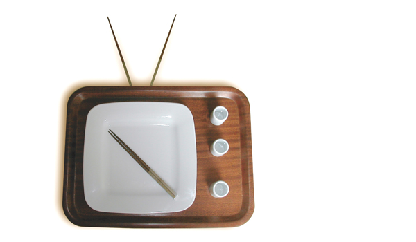
Products
The range of products to be marketed using the ublo brand name includes household and kitchen items, lighting and personal accessories. These will be high end quality consumer items constructed from modern and contemporary materials.

Execution
While Nichols is unsure as to whether or not the products should be marketed under his name or ublo, ublo tends to lean towards a more recognisable and modern/fresh name. Mock-ups under both names will be produced as the symbol is sepearte from the logotype. Client approval will then be required to finalise.
The design will be influenced by Rohan Nichols background in jewellery, metal smithing, industrial design and will reflect the ublo range; a distinct lack of angles, fluid design and a somewhat organic form.